Cheapest Energy Isn't Cheapest Power
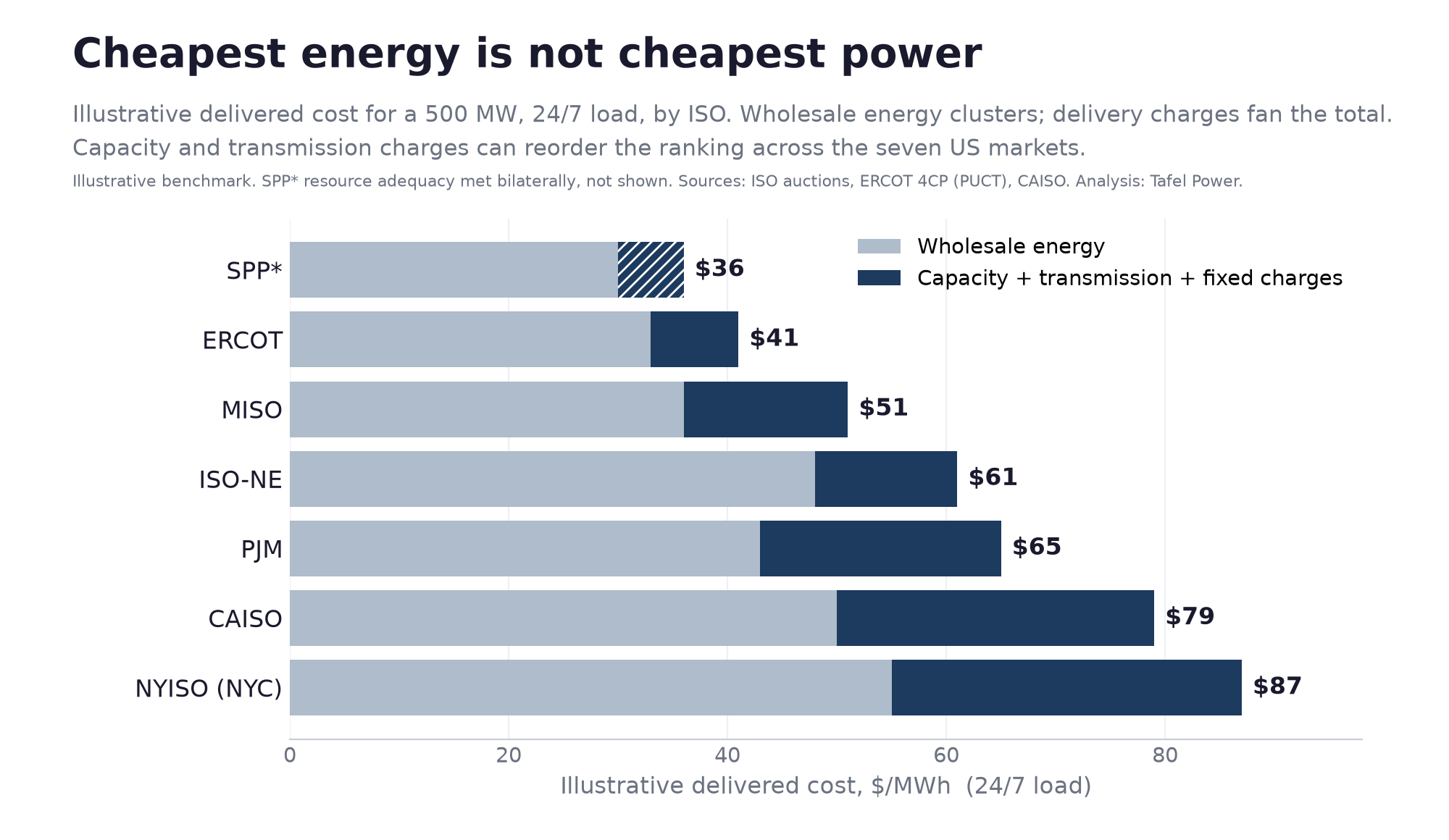
An illustrative benchmark of what a 500 MW load at a 95 percent load factor pays for delivered power across the seven organized markets. Wholesale prices cluster between 30 and 55 dollars per MWh. Delivered, the displayed totals run from about 36 to about 87.
For hyperscalers · For infra funds · For developers · delivered-cost · capacity · transmission · siting · data-centers
Kris Narayanan · Tafel Power · July 14, 2026 · 6 min read
Here is an illustrative benchmark of what a 500 MW load at a 95 percent load factor may pay for delivered power across the seven US organized markets, with NYISO represented by Zone J.
ERCOT sits near 41 dollars per MWh. MISO near 51. ISO-NE near 61. PJM near 65. CAISO near 79. New York City near 87. SPP shows lowest at about 36, and that one needs a caveat, which is below.
Wholesale energy across those same markets runs from roughly 30 to 55 dollars per MWh. So on energy alone the markets look similar. Delivered to a load that runs at high utilization every hour, the spread roughly doubles.
What fans the total
The light band is wholesale energy. The dark band is capacity, transmission and other delivery-related charges spread across the load's consumption. Energy clusters. The dark band is what separates the markets.
A developer that ranks sites on the energy price alone can pick one that looks cheap and is not. The gap between the lowest and highest displayed totals is mostly a decision about capacity and transmission exposure, and that decision is made when the site is chosen.
PJM shows what a posted price is and is not
PJM is worth reading closely, because its capacity price is currently set by a rule rather than by where supply met demand.
Its last three Base Residual Auctions all cleared at the FERC-approved cap across the entire footprint. The 2026/2027 auction cleared at $329.17 per MW-day on an unforced capacity basis, announced July 22, 2025. The 2027/2028 auction cleared at $333.44, announced December 17, 2025. The 2028/2029 auction cleared at $325.00, announced July 14, 2026.
The auctions did clear. What they did not do is reveal an unconstrained price. When a result settles at an administrative ceiling three times running, the posted number tells you where the ceiling is, not where the market is.
The 2028/2029 auction also came up short of PJM's own reliability standard. It cleared 138,318 MW of unforced capacity. Adding 10,864 MW self-supplied under the Fixed Resource Requirement gives 149,182 MW in total. PJM's RTO reliability requirement for that delivery year is 156,013 MW, so total procurement fell roughly 6,831 MW short.
Note also that the newest print is 2.5 percent below the one before it. That is a recalculation of the cap, not a market cooling, which is the same point from the other direction.
What this chart can and cannot decide
It can tell you the delivery charges are large enough to reorder which market is cheapest. That is the finding, and it holds.
It cannot give you a clean like-for-like comparison, because the delivery charges are different products. An auction capacity price, a bilateral resource adequacy cost, a peak demand transmission tag and a volumetric tariff charge do not convert into one comparable number. Treat the output as an illustrative benchmark, not a league table.
SPP is the sharpest illustration. It appears lowest here, and that is an artifact of the method. SPP runs no centralized capacity market, so no market-clearing capacity price is assigned to it. Its resource adequacy obligation is real and is met bilaterally. The cost exists. It is simply not visible in a chart built this way, which is why SPP should not be described as the cheapest market.
Some of the cost is manageable, some is not
Capacity and transmission exposure is not fixed. A load can lower it by where it sites, by the voltage and tariff class it takes, and by how its retail supply is structured. In ERCOT, a large load's transmission charge is set by its demand in four summer peak intervals, which a load can manage directly, though that mechanism is under review by the Texas regulator.
Other charges do not move with the clock. CAISO's Transmission Access Charge is assessed volumetrically on internal load, so shifting the same consumption across hours does not reduce it. Fixed tariff charges and taxes behave the same way. Any credible estimate has to separate what a buyer can move from what it cannot.
Cost is the second question, not the first
This piece points at delivered cost. Other work here points at time to power, and argues that equipment lead times and interconnection now set the schedule. Those look like they conflict. They do not, and the order matters.
Delivered cost is the right screen conditional on power being available on the date the load needs it. Where availability binds, speed dominates and cost becomes a tiebreak among the markets that can actually serve you. A site that is 20 dollars per MWh cheaper and two years late is not cheaper. Screen for date first, then run delivered cost across what survives.
What it is worth
For a 500 MW load at a 95 percent load factor, the gap between ERCOT and PJM in this benchmark implies an annual cost difference of roughly 100 million dollars, on similar wholesale energy. That is a live siting choice.
The full width of the benchmark, ERCOT against New York City, implies closer to 190 million. That number is bigger and less useful, because Zone J is not a real option for most large loads. Use the comparison you would actually make.
Either way it is a siting and structuring decision rather than an energy-price decision, and it is made before capital goes in the ground.
Methodology
The figures are an illustrative, standardized benchmark: a 500 MW load at a 95 percent load factor taking transmission-level service, with all components converted to dollars per MWh. Annual figures use 4.161 million MWh, which is 500 MW at 95 percent over 8,760 hours.
The components are different product types, including auction capacity, bilateral resource adequacy, transmission-tag exposure and tariff charges, so the output is indicative and not a like-for-like price. That limitation is stated in the body rather than only here, because it changes what the chart can be used for. It excludes interconnection and other one-time costs. The chart shows point estimates and carries no plotted uncertainty range, so it should be read as a benchmark rather than a measurement.
The benchmark reflects market and tariff levels current to mid-2026 and should be rerun against the prevailing auction and tariff vintage before use. The PJM component reflects a capacity price at the FERC-approved cap. The three auction prints named above span $325.00 to $333.44 per MW-day, a range that moves the PJM stack by well under a dollar per MWh, so the chart holds across all three.
New York is represented by NYISO Zone J, New York City, where capacity clears well above the statewide level, so the top of the range is a constrained-zone figure and not a statewide one. SPP has no centralized capacity market and no separate market-clearing capacity price is assigned to it here, which makes its position an artifact of the method rather than a result. It should not be read as implying that resource adequacy in SPP has no cost.
PJM figures are from PJM's Base Residual Auction news releases for delivery years 2026/2027, 2027/2028 and 2028/2029, and the 2028/2029 Base Residual Auction Report, which states the RTO reliability requirement of 156,013 MW. Other sources are the remaining ISO capacity auctions, the ERCOT four-coincident-peak transmission tariffs on file at the PUCT, and the CAISO transmission access charge tariff.
All analysis by Tafel Power from public sources.
Questions, corrections or disagreement on any of this are welcome: kris@tafelpower.com
More from Insights
July 13, 2026
The ERCOT Queue Cannot Distinguish Captive Gas from Speculation
For anyone screening ERCOT gas by interconnection status: a dedicated plant can be under contract to a named customer and still appear in the queue as unsigned and in study. Project Kilby shows why captive generation needs a separate diligence framework.
July 12, 2026
If You Can't Get a Turbine Until 2029, What Powers the Load?
For hyperscalers, developers, and infra funds: the firm-power options that can actually connect before the gas-turbine backlog clears, ranked by how fast they deliver.